Downing Creative
Published in the Nelson Mail 08.08.18
Ask any producer and they will tell you making a product is the easy part, selling it is another matter altogether and that is where Tony Downing and the team at Downing Creative shine.
Downing Creative started out as a design business in 1994 but as the world has changed so have they, as the name suggests they work with businesses helping them create brands for their businesses and products in the marketplace.
I have known Tony for many years, he designed my website and is currently working on an update for me, and part of that update process is me understanding what I want from the site and how I want to project myself to the world as a wine and food writer.
With that in mind I wanted to know more about what he does for his customers, particularly those involved in producing beverage and food products, so I sat down with Tony and designer Joseph Norris last week and asked him a few questions about the importance of good design.
“It is more than just advertising and creating pretty images, we help clients create a brand, something that reflects not just their products but them as a business too” says Tony “We’re not just the colouring in department.”
 “One of the things we love doing is taking a product that fundamentally isn’t too different from a competitor and finding a genuine difference we can build on.
“For example, with wine how do you make it stand out, have its own presence on the shelf and in the market place.
“We know that there’s hundreds of wine labels out there, so how do you make it have its own identity and work within the framework of label size and bottle shape? These are the boundaries we have to work within, and designers love having boundaries or we can get really carried away, then we try and create a story around something within the frame.”
Tony told me that often times when you dig a bit deeper and take the time to get to know the people behind the product, the place, the geography of their land, where they come from, their history, a story begins to emerge, a spark of an idea, or what appears to be a throwaway comment, becomes the bigger idea.
“The other side of that is we look at the customer it is going to and think about what will inspire them or what is going to excite them. If you think about a show, when you buy tickets to a show you don’t know exactly what that show is about until you go to it; the same happens with wine, you don’t know what the wine is about until you open it and pour it into a glass. The label is like the show poster that inspires you to buy the ticket.”
“The label and the brand has to make a big promise about what the experience inside the bottle is going to be.”
Joseph told me that understanding the experience the customer wants is really important, they want the unpacking of that product to be a good experience, be it a budget product or a premium product, the customer’s expectations created by the packaging have to be met and when it comes to a premium product the prestige of the product has to be obvious to the customer.
 “If you embellish a label with gold foil and put it in the bargain bin it doesn’t feel honest, there is a disconnect between the promise of the packaging and the product, often with food packaging people try and put an average product in amazing packaging and it just isn’t honest, there is a disconnect.”
“It is important to understand what the customer wants and to have a really clear strategy about where you want to go with it in the long-term.”
Tony says “we are really big on creating a unique personality in the brand, so we almost treat the product like a person and ask, what personality does it have, are they an interesting person to hang out with? These are attributes that can be passed on to a product as well, we can make it look alluring and fun or solid and reliable, those are the things we try and bring to a brand to add more value in the minds of the customer.”
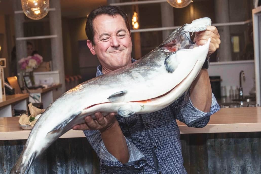
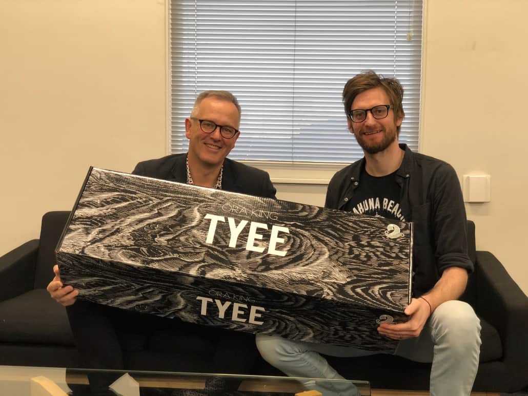
As an example Tony and Joseph talked about a new brand for New Zealand King Salmon, TYEE (pronounced tie-ee), it is a salmon that doesn’t reach maturity but grows to a huge size, up to about 14kg, and it is only recently that it has been thought of as a marketable product.
“Ora King is their premium salmon product and TYEE is ultra-premium, it is a tiny percentage of their production but the size of each fish puts it into a similar category as say a premium bluefin tuna so we have worked with New Zealand King Salmon to develop a massive story around the product to enhance that value even more.
“Last year we started working on developing a brand that would sit above Ora King and taking this to market as an ultra-premium brand, this is a world first product, it is totally unique and represents a miniscule proportion of salmon sold in the world”
Joseph says “when we looked at building this as another brand for New Zealand King Salmon we looked at the size of the fish, its rarity and thought of building the brand as creating a myth, a story that is a narrative telling about the legend that is the TYEE.”
Check out the story of the TYEE on the Downing Creative website (www.downing.nz/portfolio), where you will find teaser clips and other promotional video material, “we have a huge amount of creative talent in this region so we were able to have all the work done in Nelson,” says Tony, “Jose Cano has an underwater filming tank, Daniel Allen created the video and we developed the whole concept and production process.
It is a really good case study of taking something that was hidden away and creating a whole value around the story, the embellishments on the box, logo design and everything else needed to create immense value for a product that is special, the brand takes it to a whole other level of value.”
TYEE are now so popular, and scarce, they are sold out months in advance to premium restaurants in Japan and New York.
Tony says their job is to create magic, “no one sees the work that goes in to creating a piece of magic they just see the trick, we will spend weeks creating strategies that takes a product to a point the brand is a simplified version that gives people a shortcut to a great experience for Nelson Tasman products.”
“Creating identities is what we do, a lot of time is spent understanding the essence of Nelson Tasman and New Zealand, the colours, textures, tones, we think any Nelson product should have a voice that comes from our region and are really proud we are doing it here in Nelson Tasman.”
Downing Creative have been hugely successful building brands for a wide range of businesses in this region and if you check out the portfolio post on their website about the Ora King business card story you will find not just a card that won a Gold Medal at the NZ Pride in Print Awards, but a brand delivery product that is exceptional.
Related Posts
The burger taste-off
Finally, we have more choices when it comes to burgers other than the ubiquitous McDonald’s…
Tasty Beef & Pork Burgers
These Burgers are so simple to make it should be a crime not to try…
Summer Fresh Fruit Buying in Nelson
During the summer months the Nelson Tasman region is packed with things to do, most…